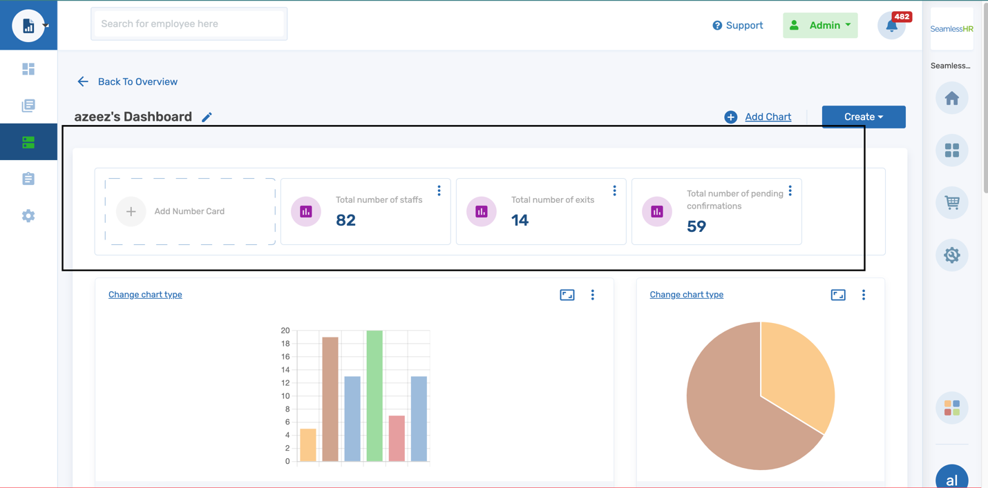
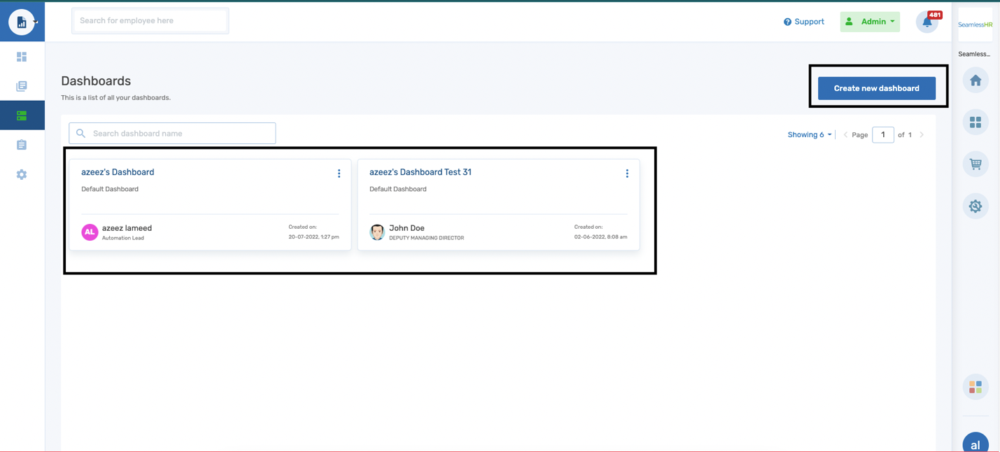
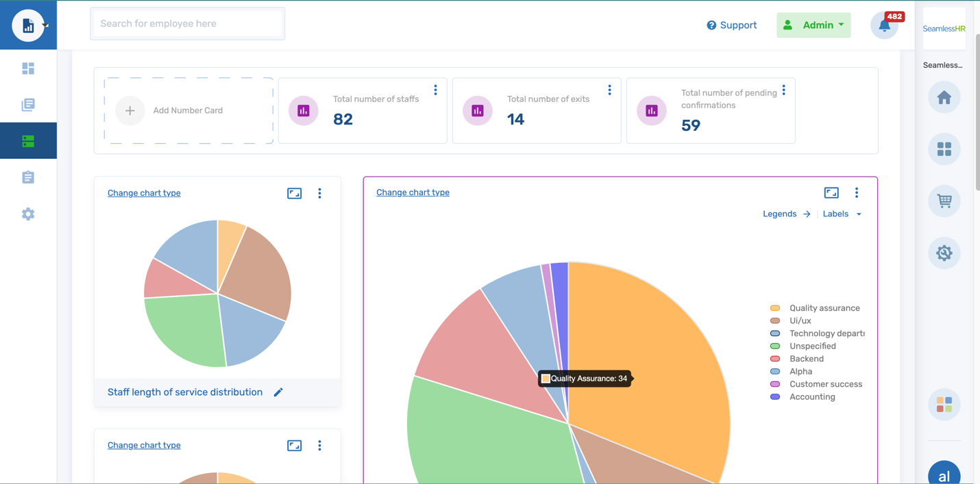
The dashboard lets users view and manage and have a summary view of the report data generated. Users can create as many as 30 dashboards on the system. The dashboard experience gives the admin a birds-eye view of multiple reports using charts to visualize details of reports generated. On the dashboard, the user can add Number cards. The user can add as many as 10 number cards at a glance.
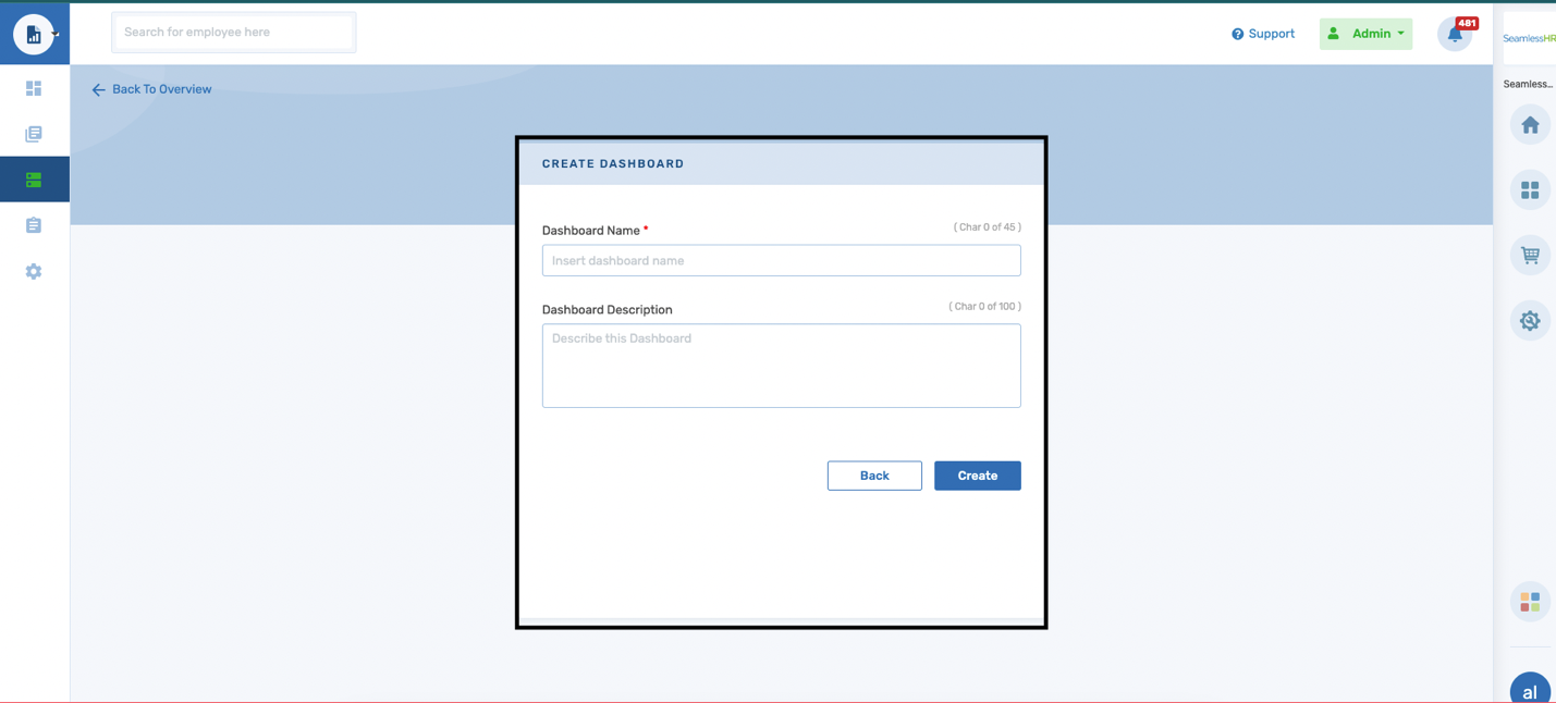
To create a new dashboard only 1 field is required, the dashboard name. The dashboard name has a 45-character count, and the dashboard description is optional with a 100-character count.
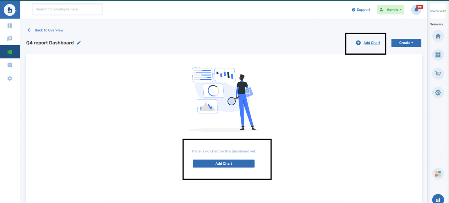
Once the dashboard is created, the user is required to add charts to build the dashboard with the most preferred charts. The user can only add a maximum of 30 charts to a single dashboard.
The add chart gives a list of all the charts available across all module libraries and is segmented according to the module library. The most recently added chart would be the starting chart on the module list.
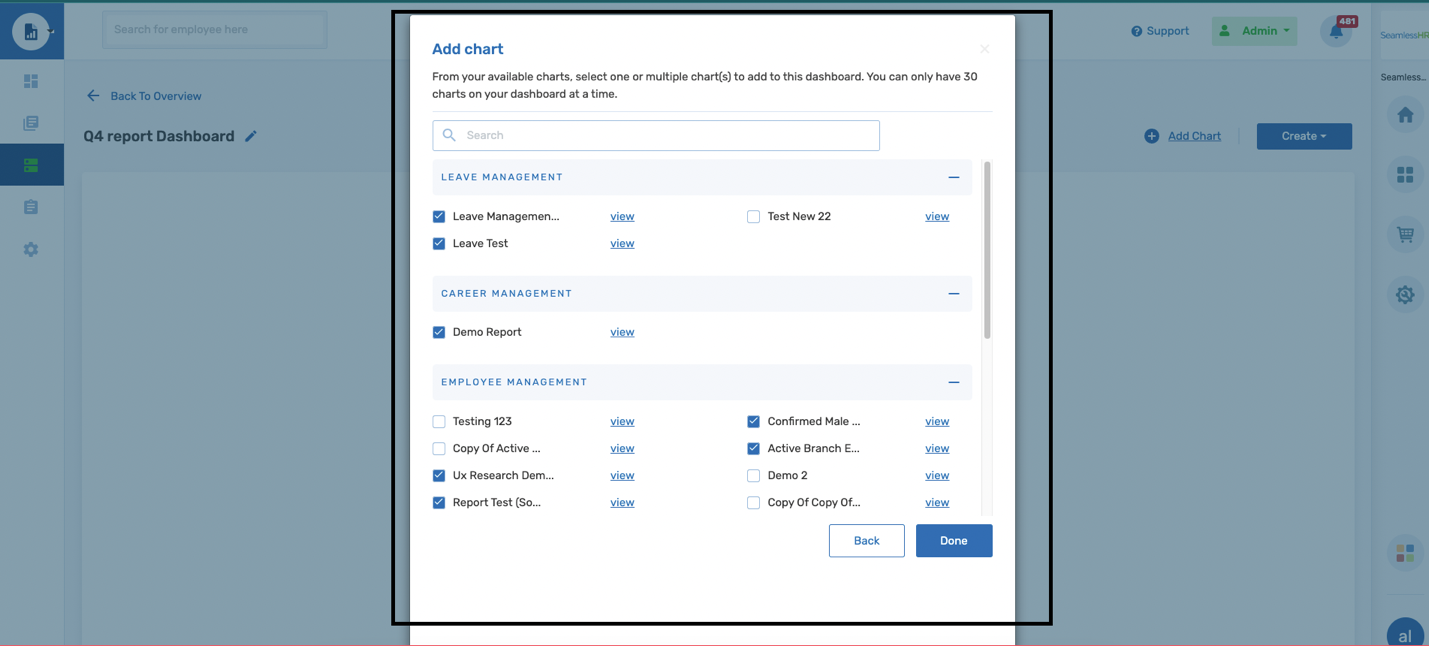
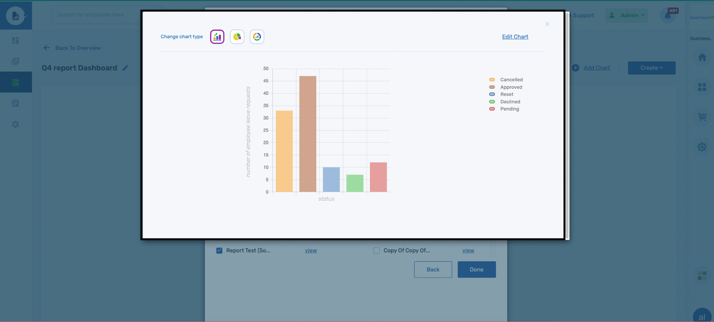
Users can preview a chart before adding the chart to the dashboard to confirm the chart added to the desired dashboard.
Once charts have been added to a dashboard, the charts can be reorganized, and the dashboard customized as the user sees fit.
The Drag icon can be used to resize the chart across grids on the dashboard. A chart can be resized into multiple grids from as small as 1 grid to 6 grids. 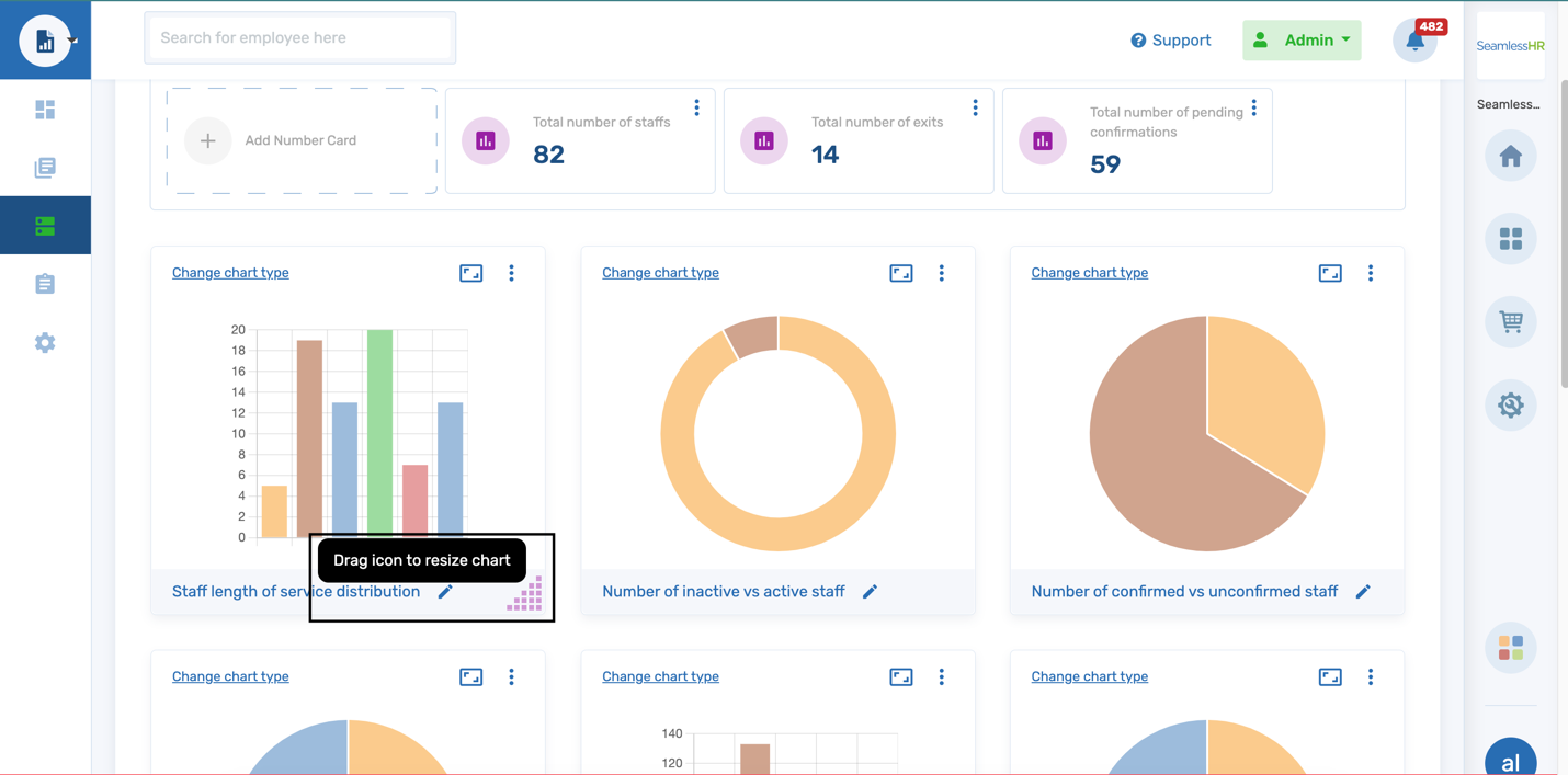
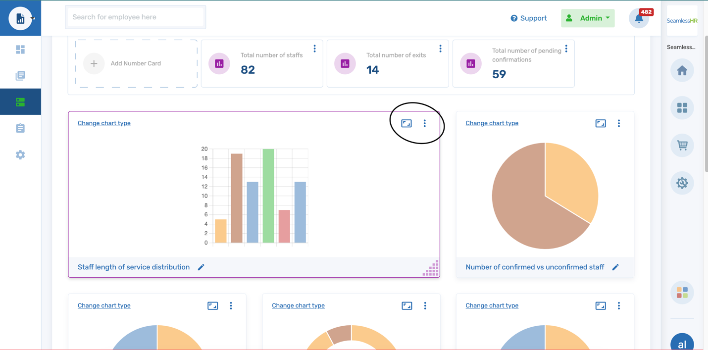
Right under the number cards are the charts. The charts are infographics that help the user make meaning and see trends from the report data generated. In the chart section, the users can customize the dashboard and do the following.
- Shuffle Chart on Dashboard Grid
- Expand Chart
- Change chart type
- Export chart
- Add labels to charts
- Add more charts to the Dashboard
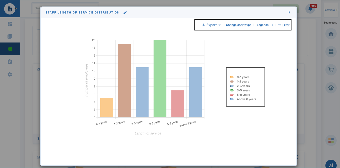
A user can also expand a chart to view more details of a chart. Using the expand icon at the top right corner of the chart.
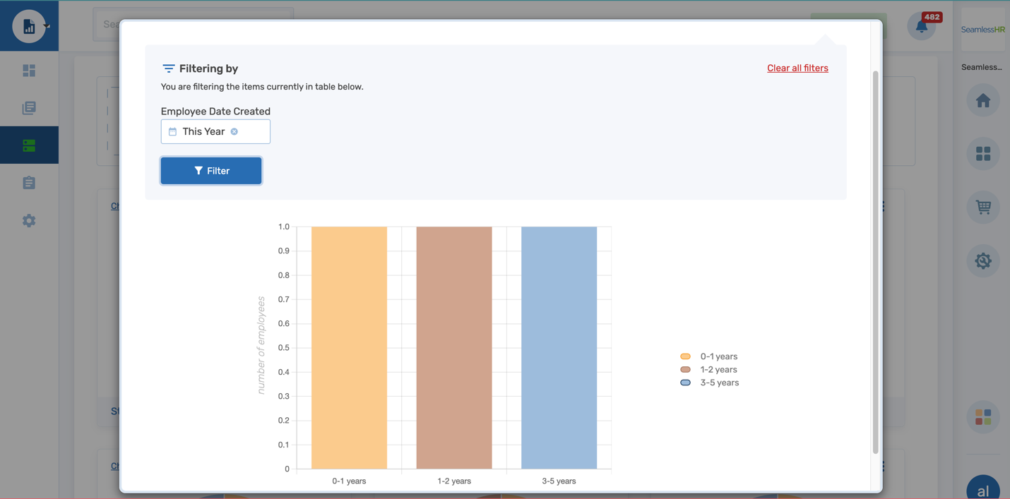
An expanded chart on the dashboard can be exported and the user can customize the chart type/style, reorganize where the legends are placed, and apply filters to the chart.
Number Cards: A number card is a numeric representation of data sums across the organization. They do not exist as charts but just as integers (numbers).