On the main overview page there a various sections on this page namely.
- Employee Demographics
- Quick links
- Recently created report
- Recurring reports
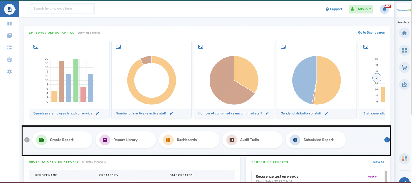
Employee Demographics: This section gives a summary and graphical representation of 5 generic employee charts within an Organization and the subsidiary logged on. These demographics include.
- Length of service: This shows the average period of the employees within the organization/subsidiary
- Active and Inactive Staff: This depicts the distribution of active and inactive employees
- Staff confirmation: This shows a summary of employee completed and pending confirmations.
- Gender distribution: This shows the gender distribution of employees within the organization/subsidiary
- Staff generation: This speaks to the staff generation by age grouping (i.e., Generation Z, Millennials, Generation Y etc.) to determine the age majorities within the organization/subsidiary
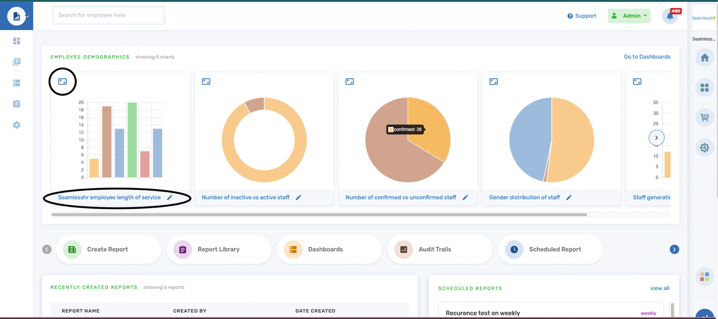
On the employee demographics, the user can rename the charts to any name of their choosing. The renaming field has a character count of 50 characters that can be inputted into the name field.
The user can also scroll vertically to see the rest of the charts available on the system. Also, the user can expand each chart to see a larger view of the chart demographic to see more details on each distribution.
The charts can be exported in two main types
- PNG
- JPEG
The charts are downloaded to the user's computer directly and can be viewed in the folder (downloads) they choose to save the file.
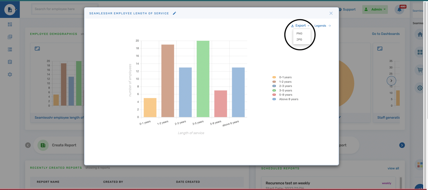
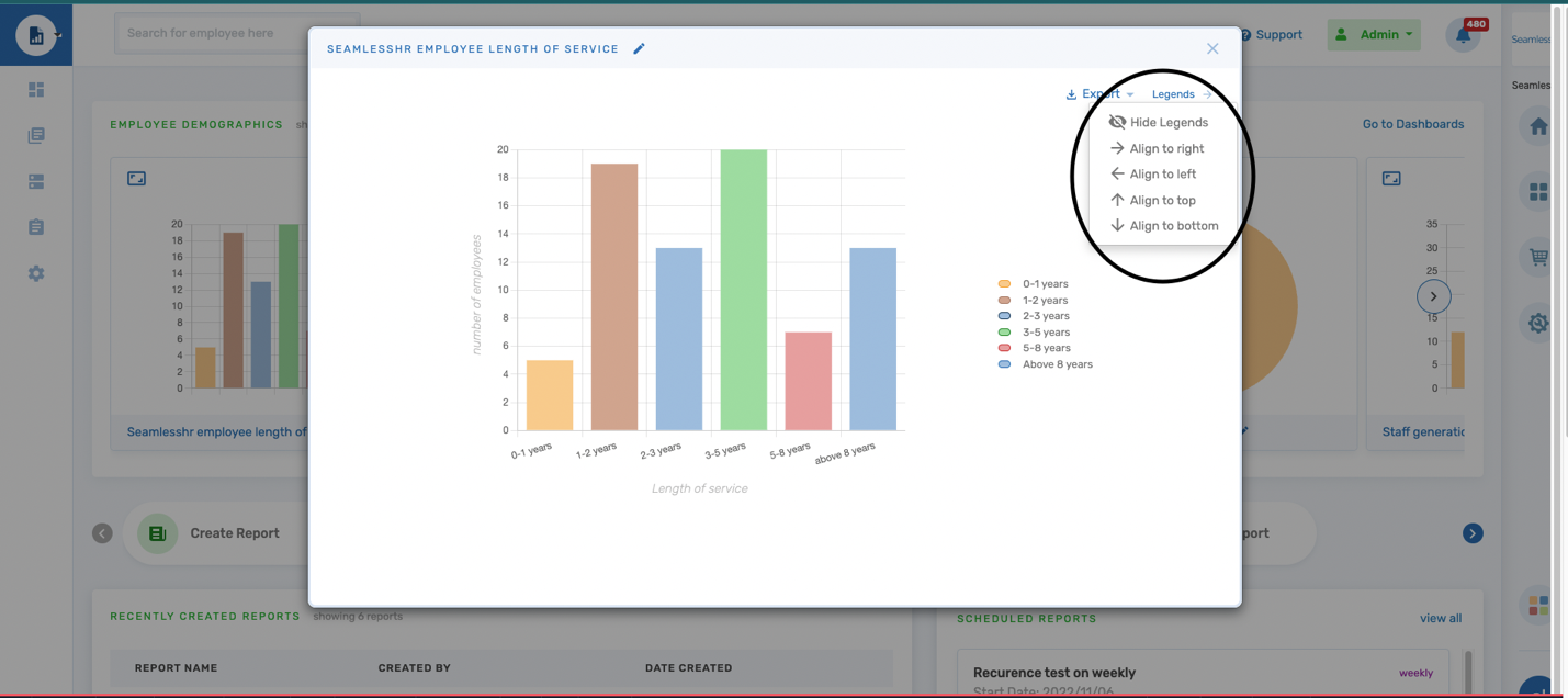
The charts legends can be adjusted in 5 different ways
- Hide Legends
- Align to right
- Align to left
- Align to Top
- Align to bottom
The user chooses his/her preferred alignment option, and this option is saved.
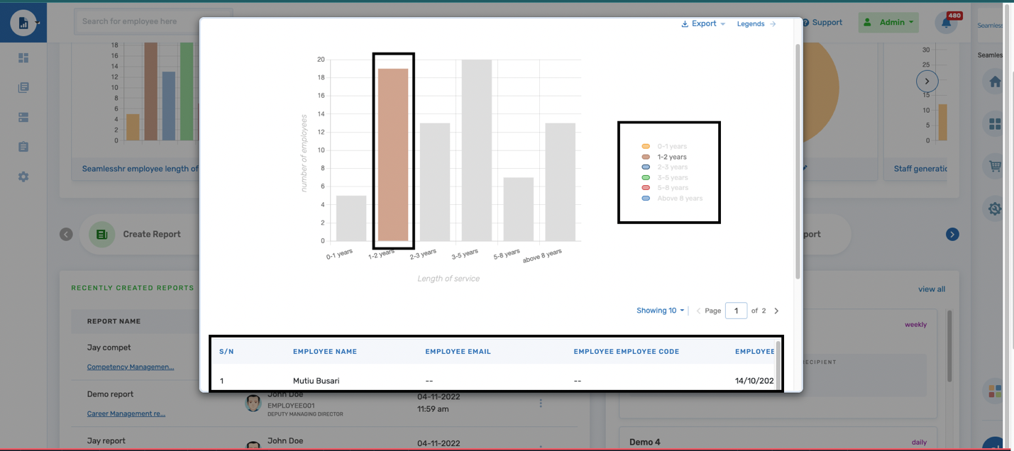
Legends can also be used as a drill-down function to help the user access the report table/data on how the distribution was generated. The user is required to select the legend of choice and the distribution on the chart is highlighted. A report table showing the raw data is displayed right under the chart and the user can run through the generated raw data for the chart distribution.
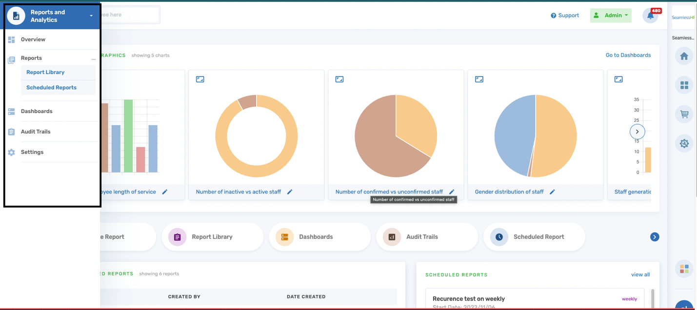
Quick links: This section is a list of top features within the module namely
- Create report
- Report Library
- Dashboard
- Audit trail
- Schedule report
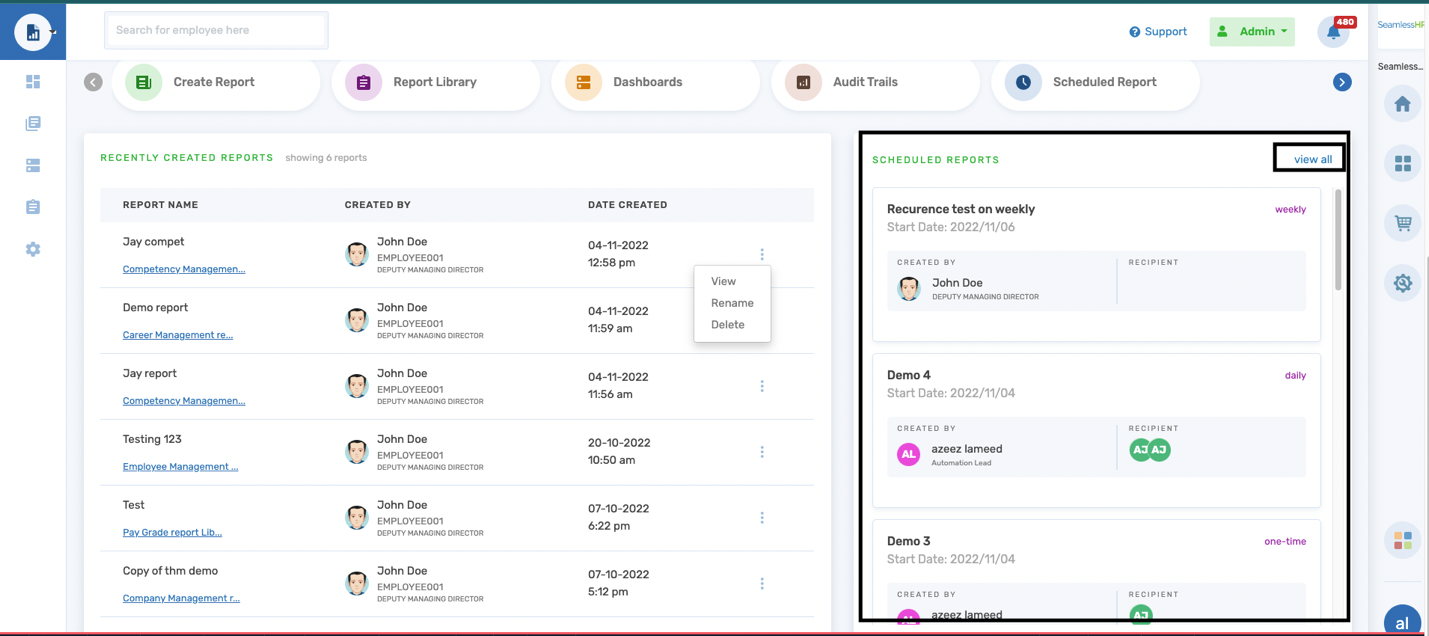
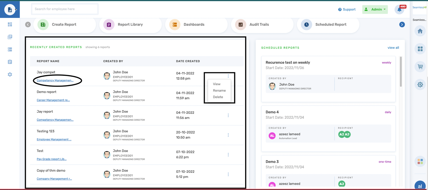
Recently Created Reports: This section shows a quick view shows 6 of the most recently generated reports on any module within the organization/subsidiary. There is a list of actions that can be taken on each report listed on this menu. The user can.
- View the report
- Rename the report
- Delete the report
All the above-mentioned action directly affects the actual report on the system. Also, under the report name for each report is the report library the report is situated, and it acts as a quick link for ease of navigation to the report itself.
Schedule Reports: This section shows a list of the most recently scheduled reports at the top of the list on any module within the organization/subsidiary.
For each schedule created we can identify the
- Schedule name
- Schedule period/date
- Schedule frequency
- Schedule creator & department
- Recipients the report is/are shared with
The user can “View all” schedules created within the organization/subsidiary which takes the user to the schedule report library.